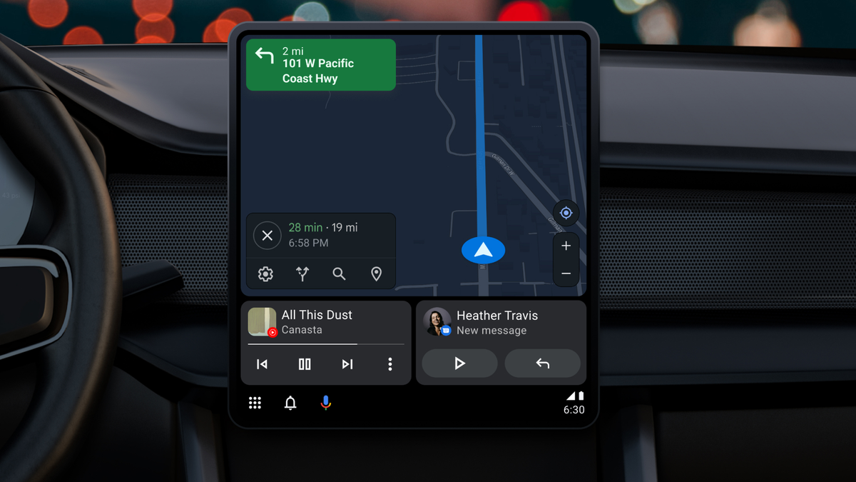
Android Auto in the dash is getting a much-needed refresh. During a session at its developer conference, Google introduced to revised interface coming to the Android-based car software. It includes a new split-screen mode that’s more scalable across different display types, plus other little bits that will hopefully cut down on how many taps it takes to find what you need while behind the wheel.
If you’ve shopped for a car lately, you might have noticed it’s getting harder to buy a model without a giant display lodged between the driver and passenger seats. Big screens in the car feel like they’re becoming the default with each new model. In following the trends, Google reworked Android Auto so that it’s easier to scale on any car display regardless of the manufacturer and screen orientation.
The split-screen mode will become the standard way of operating Android Auto. It offers immediate access to all the necessary features on the same screen, so you don’t have to tap around and switch apps while watching the road. The new Android Auto will display Google Maps and your media controls in a side-by-side window array, the way you might split windows down the middle on a computer interface. The split-screen mode will adapt to varying screen sizes and consider the display orientation, like landscape or portrait mode.
Google has also infused deeper integration with the Assistant into Android Auto. You’ll see more alerts and contextual suggestions sprout up. Assistant will also make it easier to reach out to frequent contacts and offer smart replies if you need to respond quickly and can’t touch your phone.
G/O Media may get a commission

Save $70
Apple AirPods Max
Experience Next-Level Sound
Spatial audio with dynamic head tracking provides theater-like sound that surrounds you
If your car has Google built-in, you’re getting an additional feature that could prove controversial depending on how you feel about screens in the car. Earlier this year, Google announced it was allowing folks to watch YouTube in the built-in display once the vehicle is parked. It’s adding two new apps to the lineup, Tubi and Epix Now. Both offer a ton of free video content to help you spend the time while waiting in the car.

Coming soon to a car near you
The new interface will work on a variety of screen sizes. But the way windows are oriented will depend entirely on the car manufacturer and how it lays things out. For instance, I have a Subaru with an 11-inch display. However, only half the screen is made available to Android Auto, as the other half caters to Subaru’s proprietary controls, like HVAC inside the car. Google said it’s up to the OEM to define how much space Android Auto can take up.
Android Auto’s refresh isn’t a total surprise. Rumblings over the new UI started last fall, and we had a royal tease of the new look at the beginning of the year. The new interface looks like it will be less distracting than the current interface, where apps can often take over the whole screen, requiring you to reach out and hard-press on the back button to get back to navigation.
The new Android Auto interface will start rolling out to cars this summer. I’m looking forward to testing the new look. Hopefully, it’s good enough that I can finally get over that Google deprecated my favorite Android Auto phone app.
.
