What is this, a playback bar for ants?
Alongside the barrage of hardware announcements made at Google I/O, the company also released Android 13 Beta 2 for Pixels and third-party devices alike. It’s a pretty subtle upgrade over last month’s first beta, but there are a handful of tweaks and bug fixes worth noting. On the heels of the squiggly playback bar added in Beta 1, Google has once again redesigned its media player in Android 13 — and this time, it might be worse off than before.


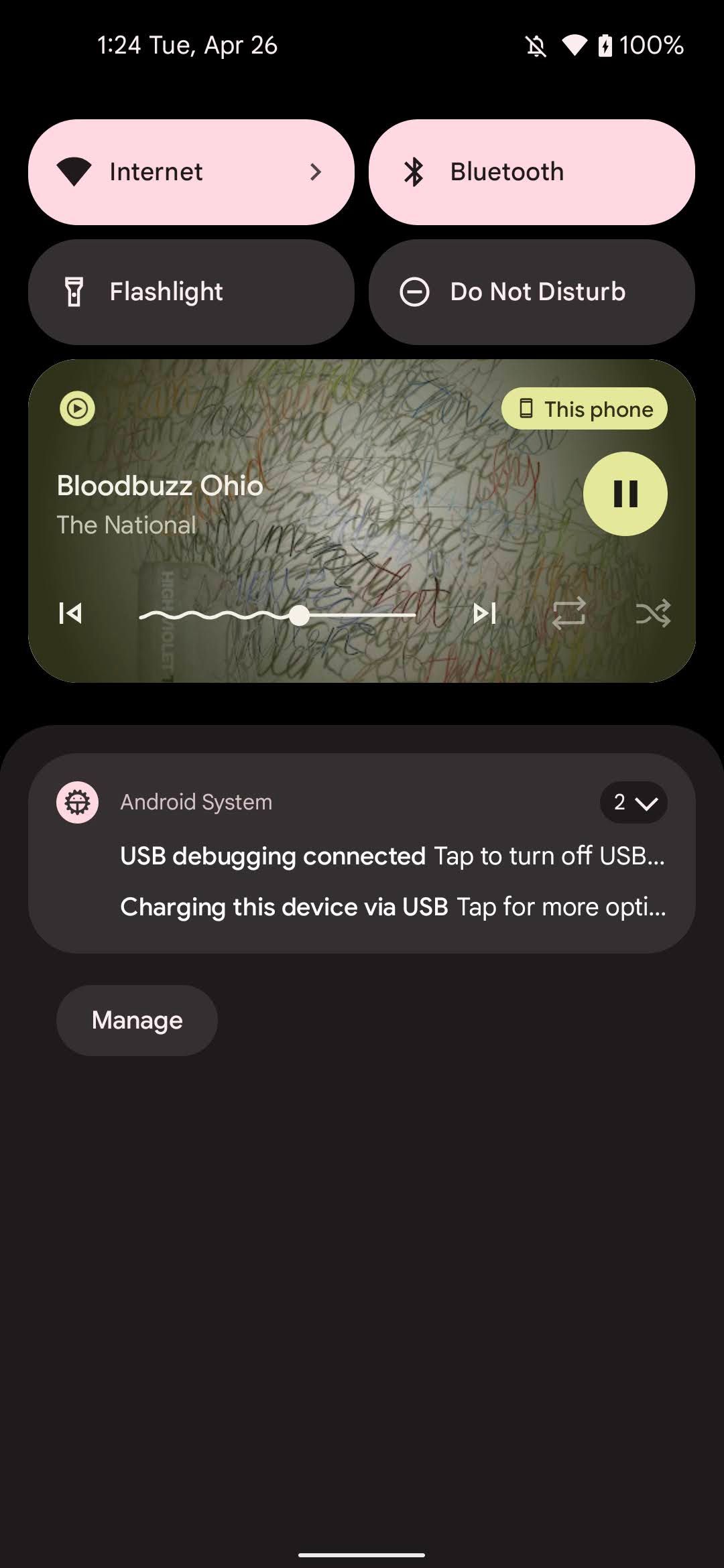
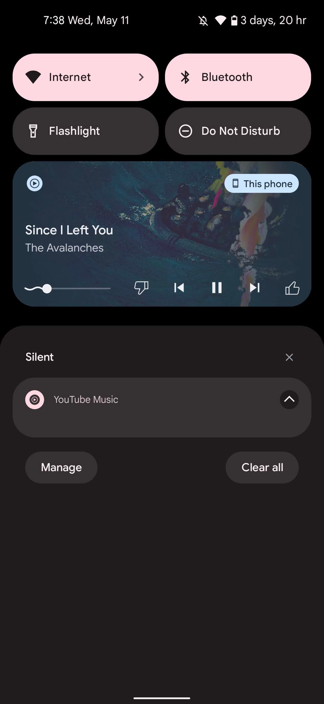
Left: Android 13 Beta 1. Right: Android 13 Beta 2.
We’ve been pretty excited to see Android’s new media player since it appeared in DP2. The redesigned player appeared on the lock screen and the notification tray, featuring a prominent play/pause button, background album art, and a larger default size. With Beta 2, Google tweaked the overall layout of the player, shrinking the playback bar and lining it up with the playback controls. The large play button is gone, leaving behind a ton of blank space, and the reorganized player controls make it easy for those of us with large thumbs to misclick a button.
Overall, it’s a worse version of the player first unveiled in March, without much rhyme or reason for why these changes are here. Yesterday’s Google I/O keynote adds some more mystery to these tweaks. The company showed off its redesigned media player on stage, proudly presenting the squiggly playback bar that first appeared in Beta 1. The version shown matches the original look, complete with its large play/pause button — not the iteration currently live in Beta 2.
Google shows off Android 13’s media player on stage.
It wouldn’t be the first time Google’s shown something off at I/O only to modify its look before the feature ever ships. Considering Beta 2 launched just as the company presented an outdated version of its media player, however, it certainly raises some questions. We’ve reached out to Google to ask what’s going on with the final look for Android 13’s playback widget.
Read Next
About The Author


-1-13-47-screenshot.png)
