
As per a recent leak on Reddit, YouTube Music has made several changes to the interface of its playlists

The playlists on YouTube Music are one of its biggest draws, and it appears that Google is testing a significant UI redesign for them in its mobile app. A French user on Reddit has shared that the YouTube playlist interface on his Samsung Galaxy Tab A7 has significantly changed, and it seems to be a test for a future update.
In the new UI, the top of the playlist shows the person’s name who created it, and when the playlist was last updated. The cover art is now centralized, and below that is the playlist name in a large font. Next up is the list of the other buttons such as download, add to library, play, share, and the overflow appearing in a straight line. Oddly, the shuffle feature seems to be missing from this list.
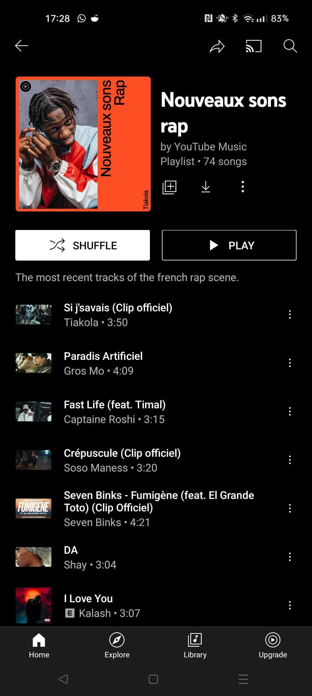
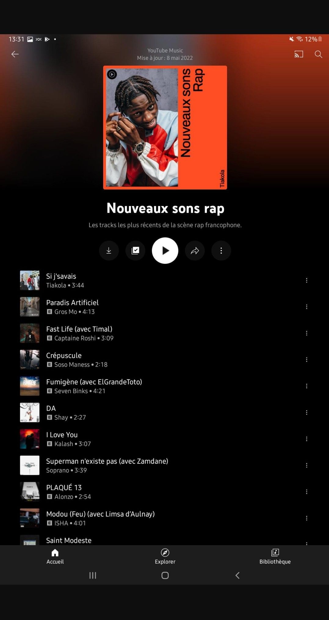
The changes have appeared only in the playlists section and not for albums. In this early testing phase, it is unknown if the changes will be made only to playlists or if it’ll extend to other sections of YouTube Music. The changes give the UI a cleaner look, with the control options in a single line, making it easier to navigate. As per 9to5Google, the changes will also apply to self-made or community-generated playlists and YouTube Music’s creations.
These developments are the most recent in a line of changes made by Google for YouTube Music, which includes adding an Explore option at the bottom of the home feed and a “Listen again” grid design for Android and iPad tablets.
Read Next
About The Author